Client: Self initiated
UX/UI Design: Beth Moeur
Date: 2021
Overview
Nomad is a mobile app solution for travel planning and making connections with the travel community. It helps users manage travel planning efficiently, whether they're traveling solo or with a group, while learning more about the locales they’re visiting by cultivating connections with fellow travelers as well as in-the-know locals and travel industry pros.
Travel planning can be overwhelming and time-consuming. It can be difficult to find information and organize it all. This app allows users to find and organize that information all in one place.
The Process
1. Discover
Research
Competitive Analysis
User Interviews
2. Interpret
IA
Sitemap
User flow
Task flow
Wireframes
UI
3. Ideate
Persona
HMW
Journey Map
4. Test
Prototype
Usability Testing
Affinity Map
Refine
1. Discover
Research Goals
- Know how other competitors offer their travel services
- Understand customers’ online habits and frustrations
- Differentiate Nomad from competitors
- Know what makes the customer want to regularly use the app
Research Methodologies:
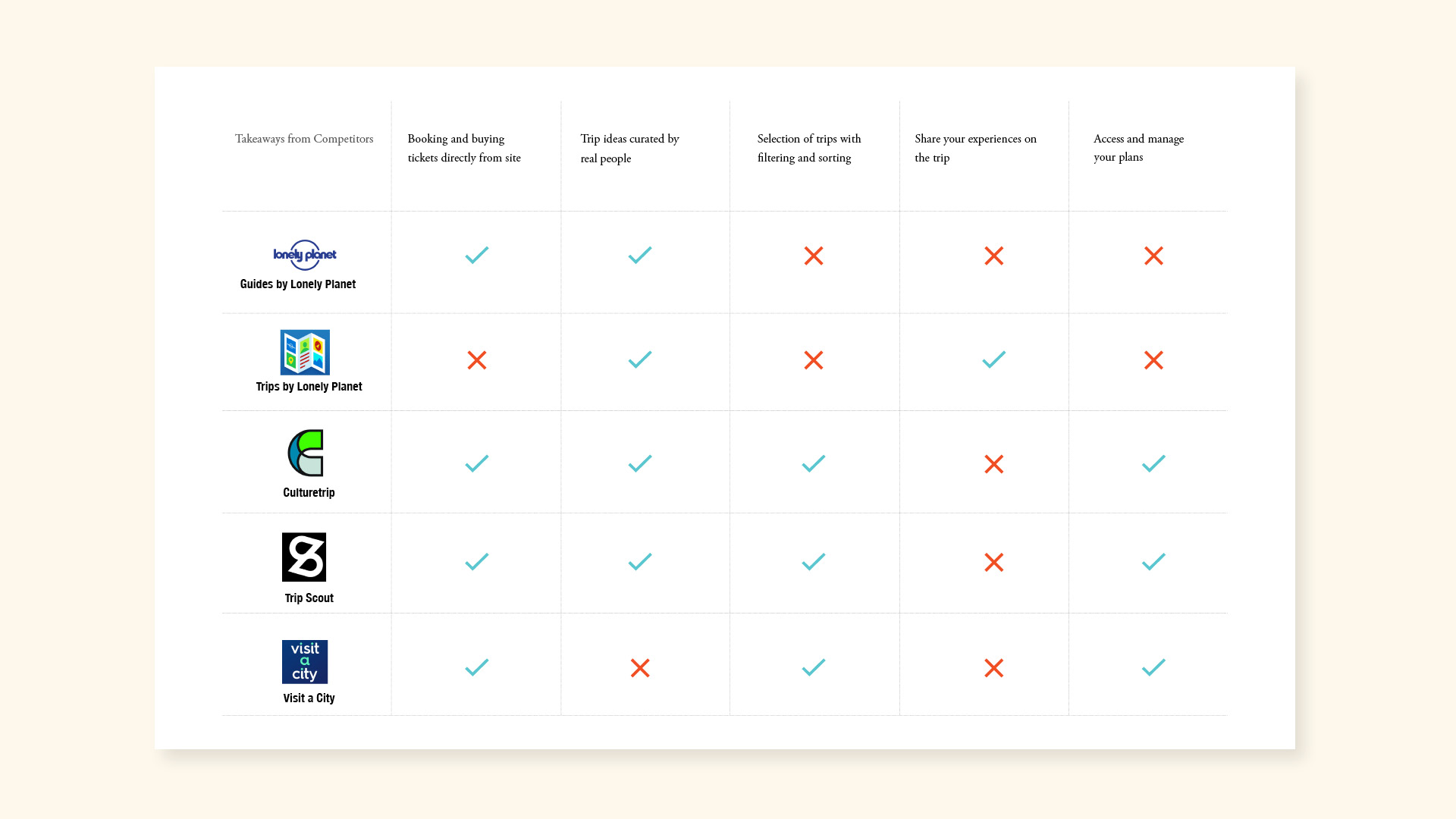
Competitive Analysis
Define competitors and understand current trends that will help set Nomad apart.
1 on 1 Interviews
I interviewed four users to gain deeper insights into user needs, motivations, and frustrations. This helped shape the travel planning experience.
Research Findings
Key takeaways from the research:
Knowledge
Create a wellspring of resources and inspirational content to help the user manage trip planning, sightseeing, accommodations, and adventures.
Community
Share and connect with a like-minded community of travel enthusiasts.
Customization
Schedule trips conveniently and efficiently.
Comprehensive
Have Information—contacts, tickets, excursions, luggage, hot spots, hidden gems, safety tips, accommodations—all in one place rather than using multiple sources.
2. Interpret
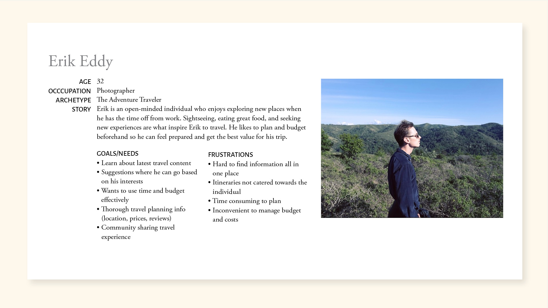
Based on user insight sessions, I synthesized my findings to create a persona: Erik. This helped me move into the ideation process.
3. Ideate
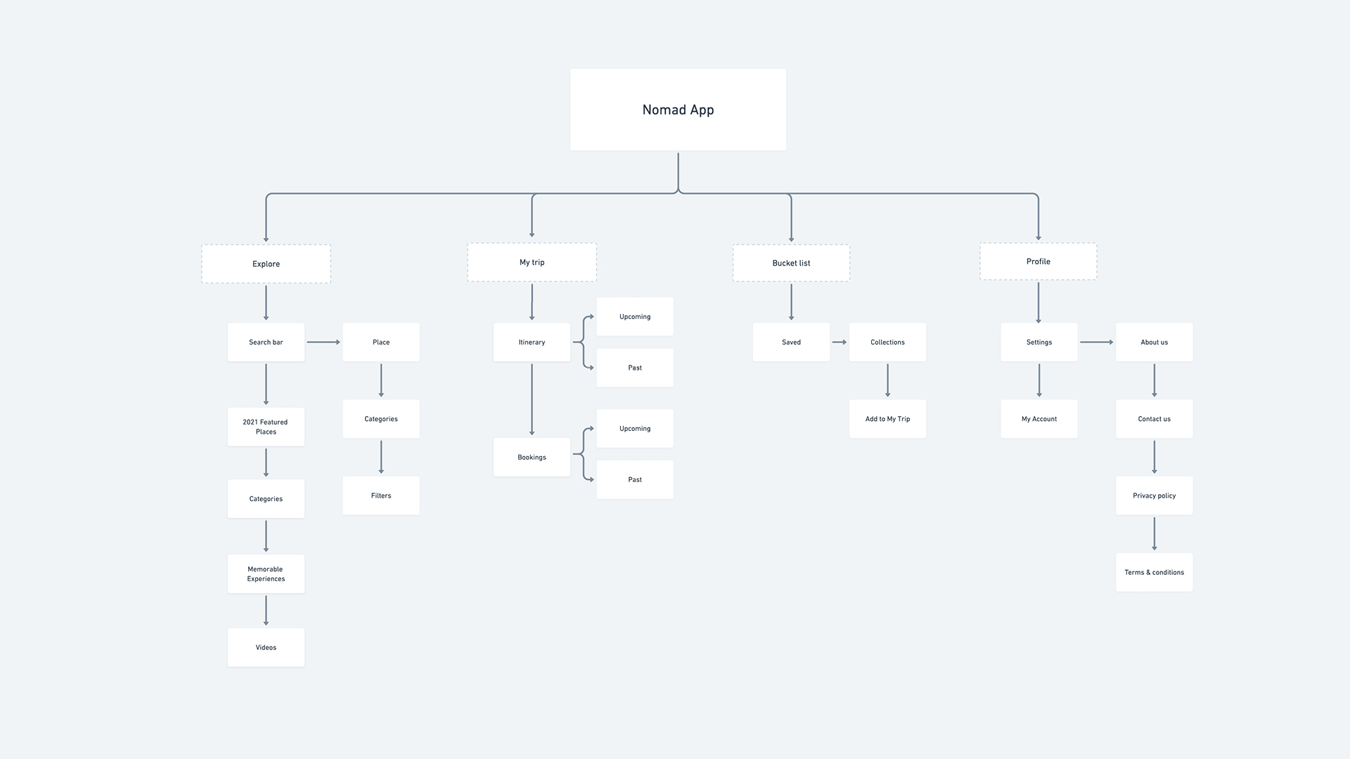
Based on what I gathered from Discovery and user insights, a sitemap was created to show the overall information architecture for the solution. The structure allows users to discover and plan efficiently by integrating exploration, travel planning, and community cohesion.
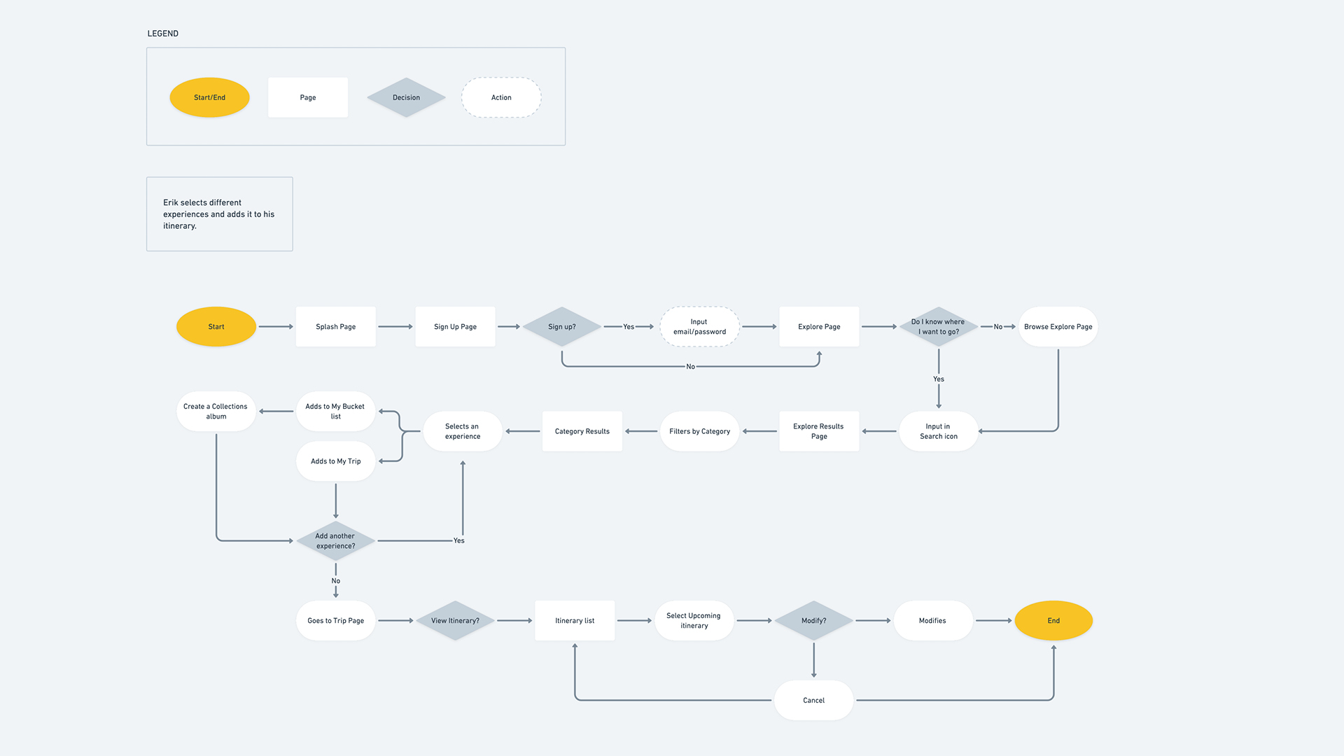
I then created a user flow that shows the actions of a user planning an itinerary and inviting friends on the trip.
Design Decisions
Once all the data was collected and synthesized for the creation of a sitemap and IA, I addressed the main concerns and insights.
Key Functionality:
- The app must serve as a centralized place to plan trips without having to use outside resources.
- The app must include informative content for every traveler, whether they’re experienced or savvy.
- Travel plans must be easily shareable with a group.
- Options must be available for users to create community-driven content.
- There must be a chat feature for the community to communicate freely.
With these insights in mind, I focused on solutions to search and plan efficiently for a trip.
- Community driven content
- Chats feature
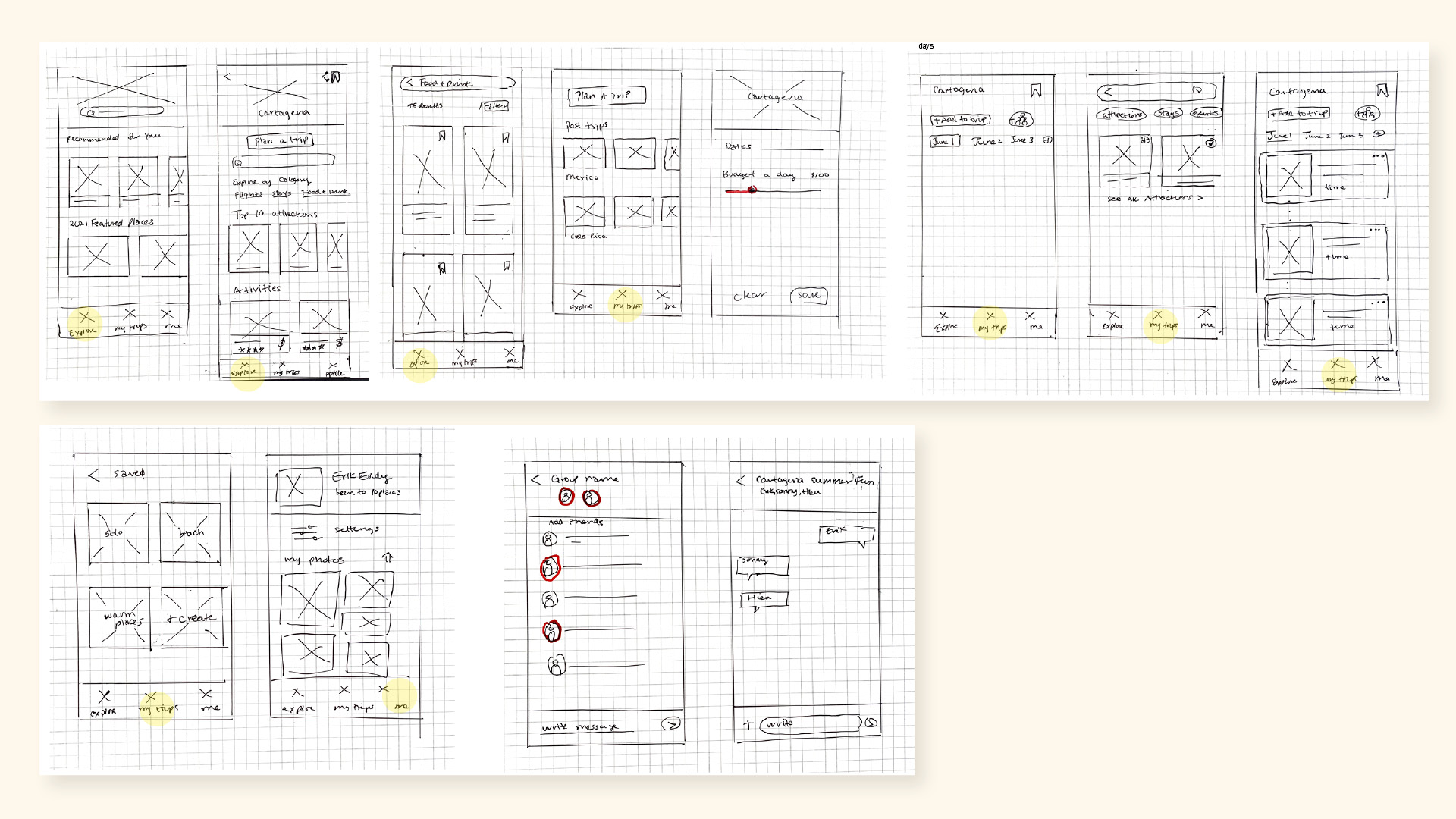
Sketches
The differentiators in the sketches:
Community driven content
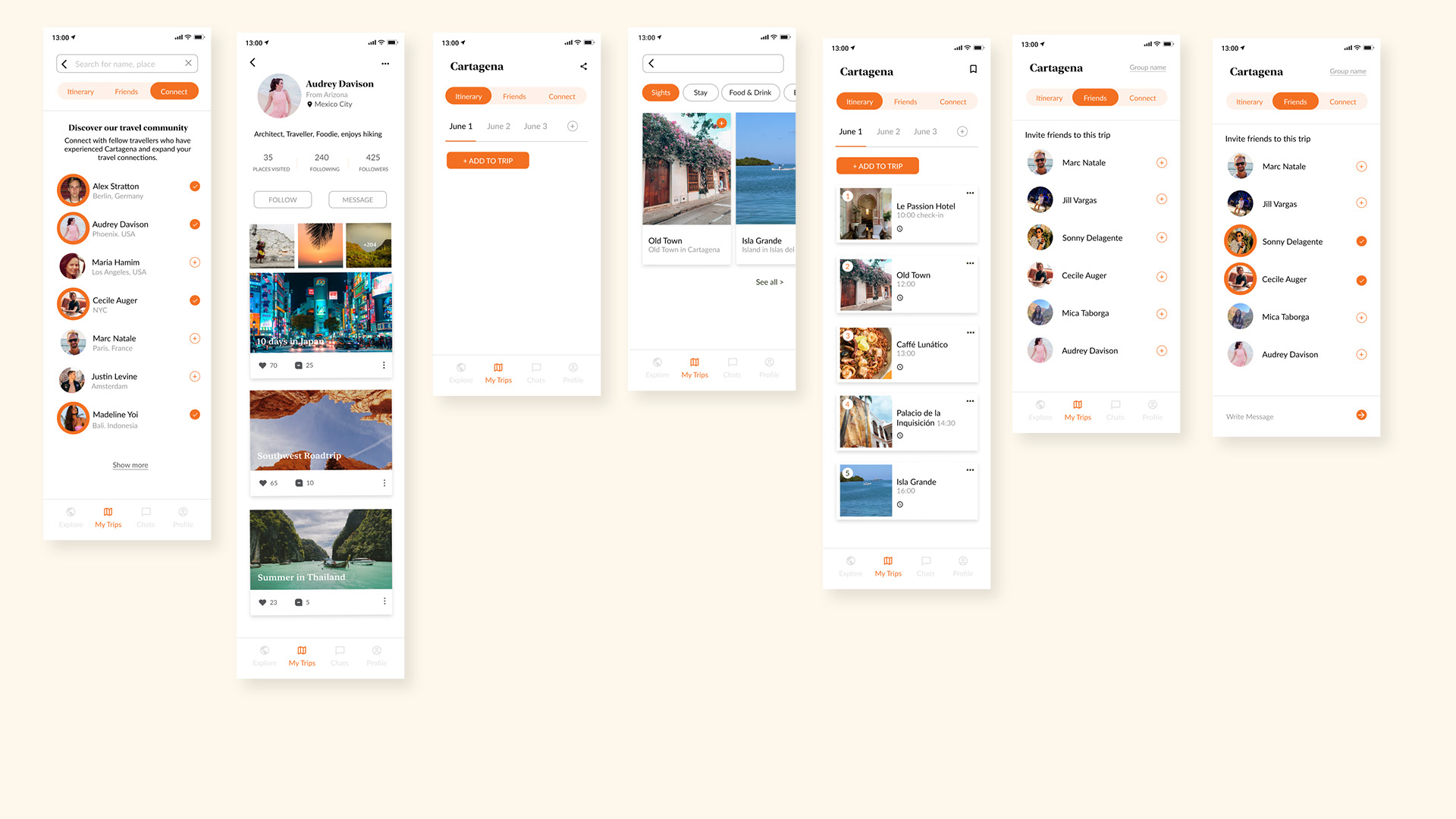
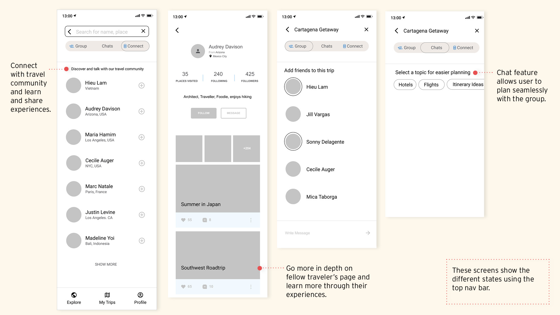
Connect with the travel community and expand connections. Learn about places by being able to engage with travelers who have had first-hand experience in places of interest.
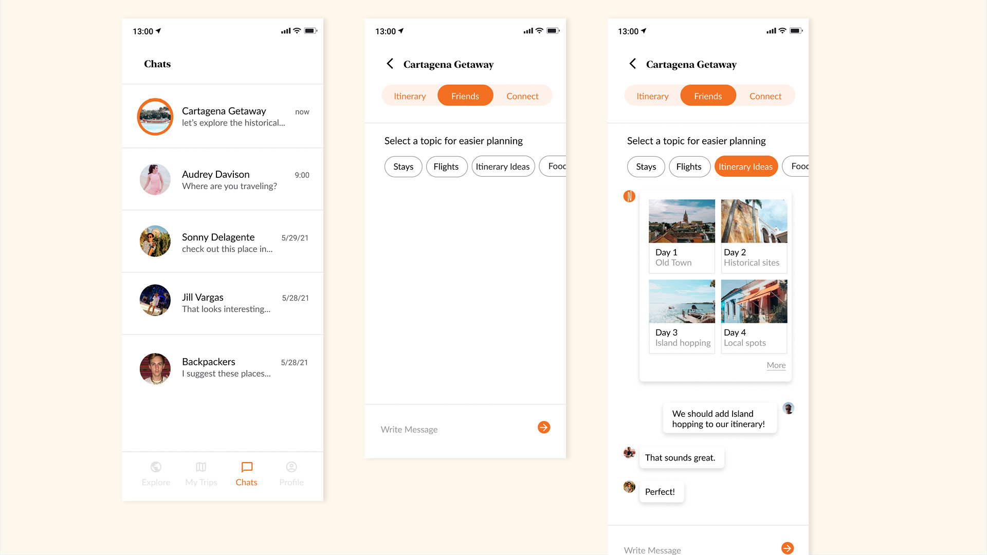
Chat integration
Whether it is a one-on-one or group chat, the app makes suggestions based on topic selections. This helps members in the chat find information to make travel planning more seamless.
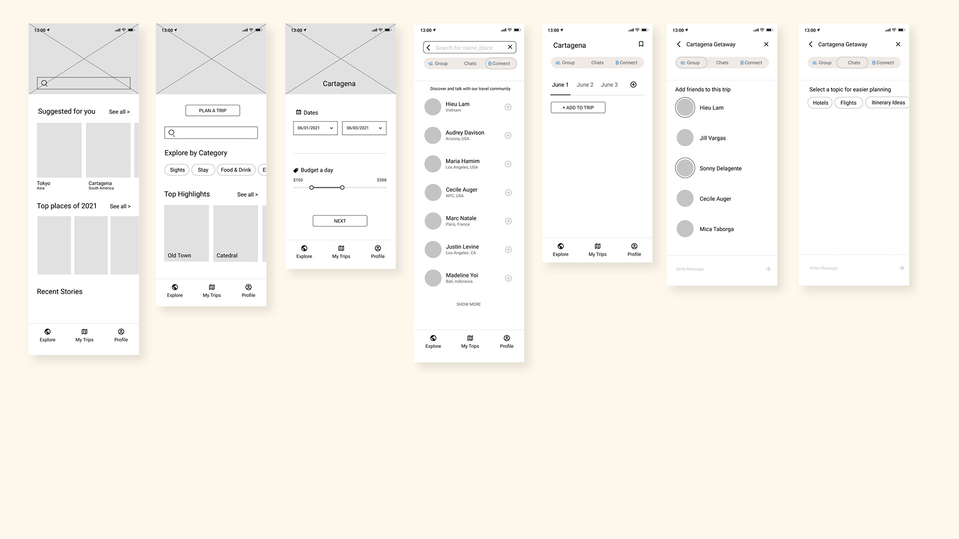
Process of wireframes
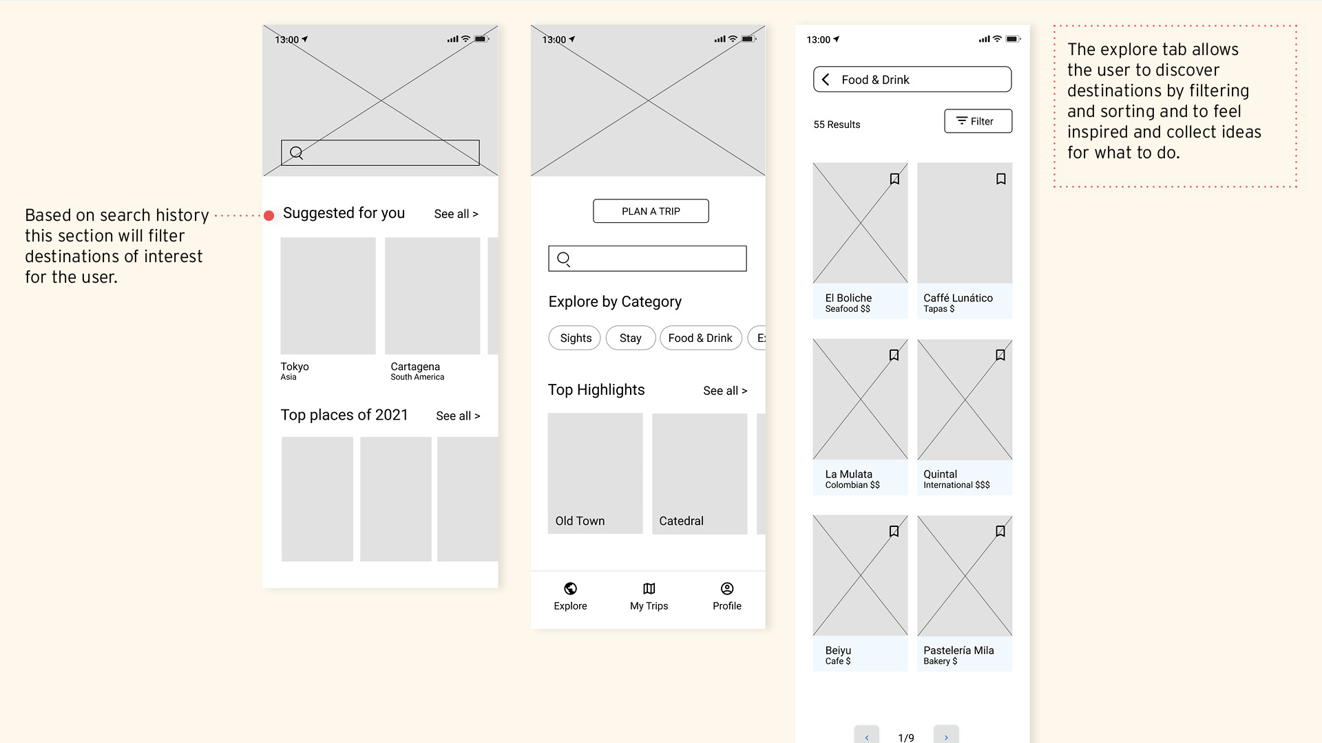
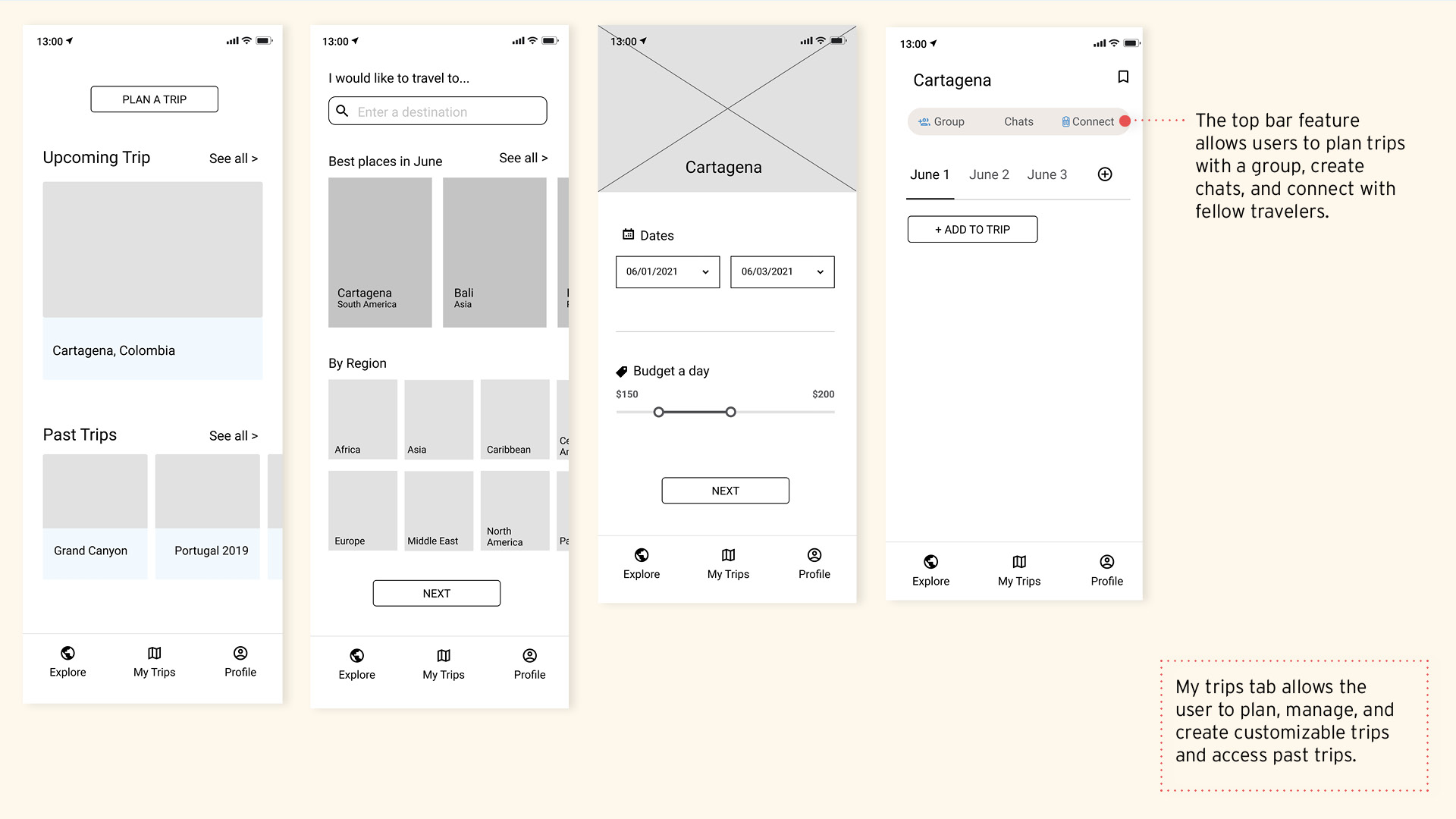
Visual Style
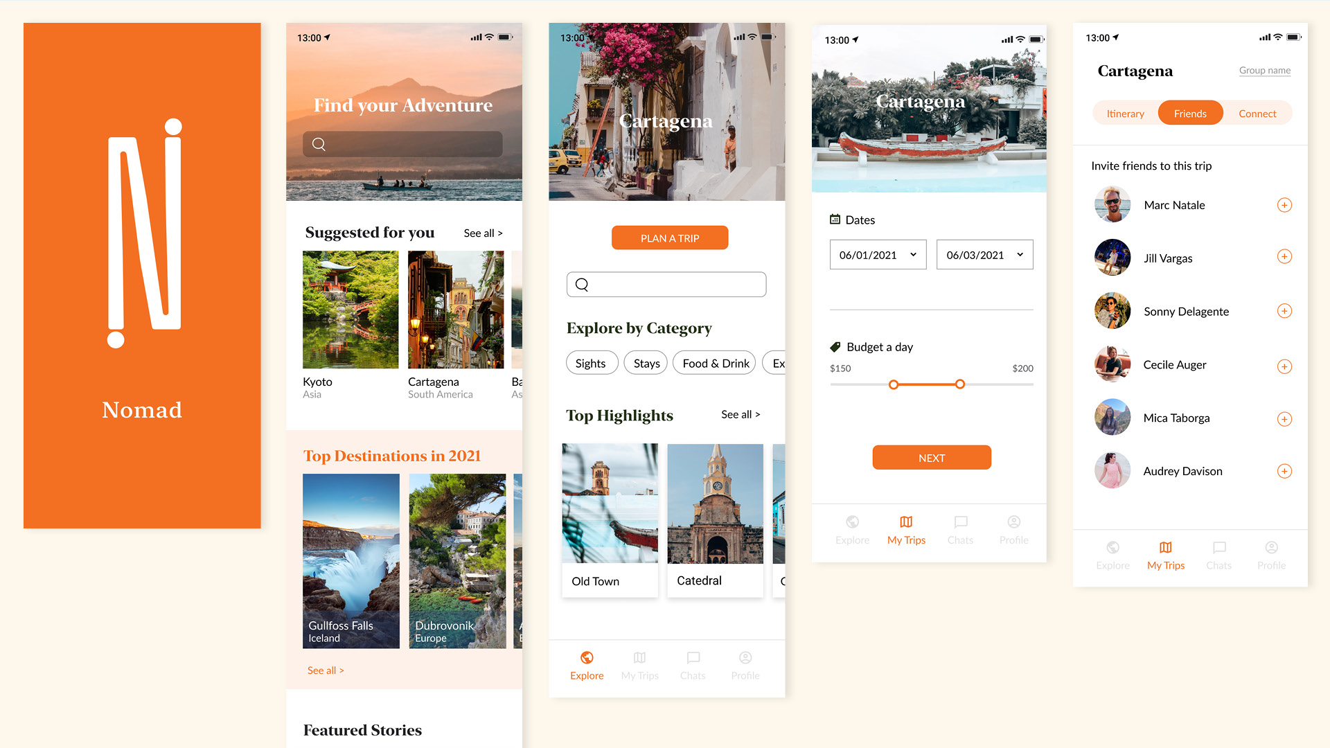
The interface uses orange hues to communicate an energizing and fresh feel. A clean layout with bold travel photos accompanies the visual design of the app.
Styleboard
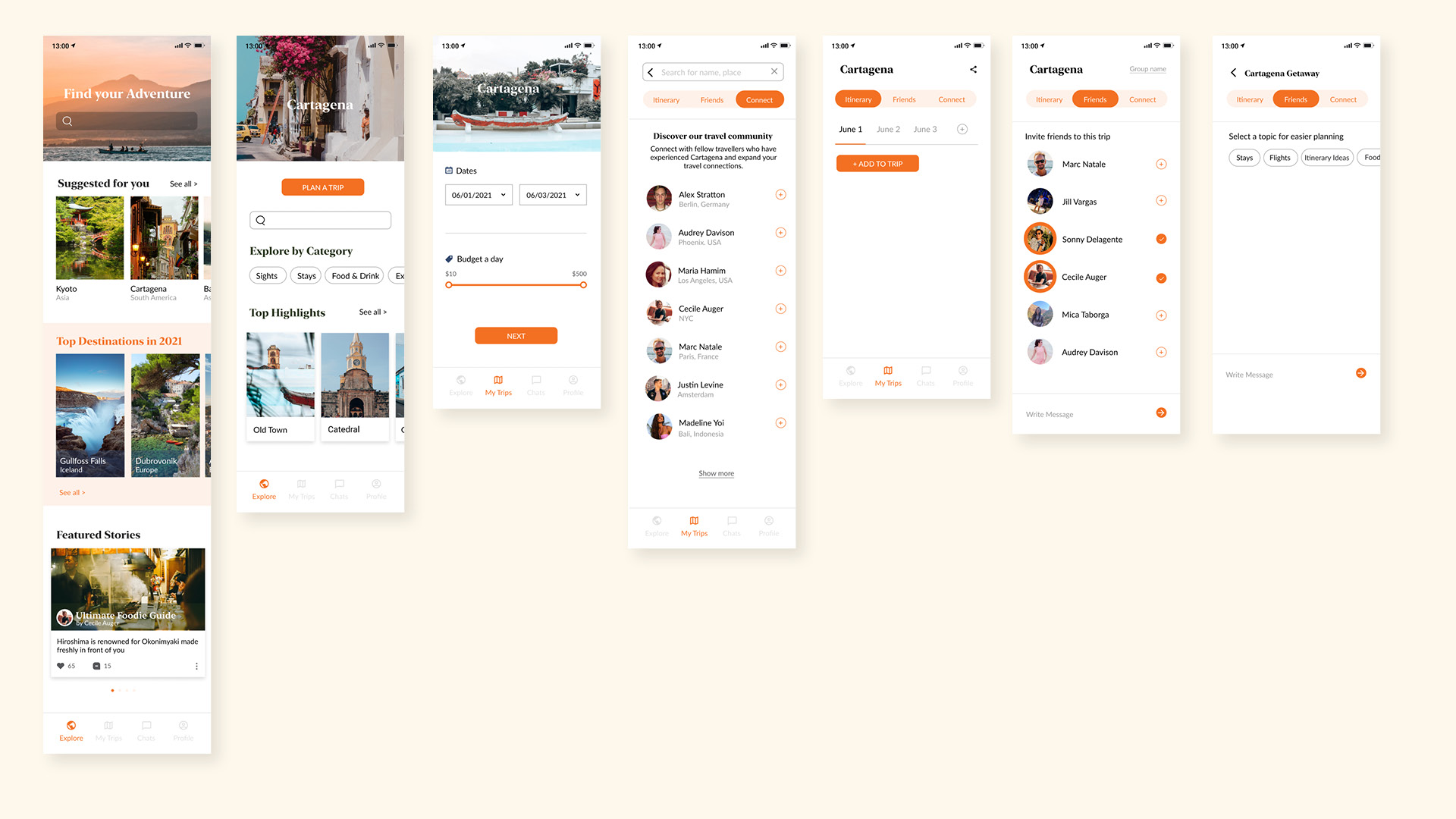
From mid-fidelity to high fidelity
4. Test
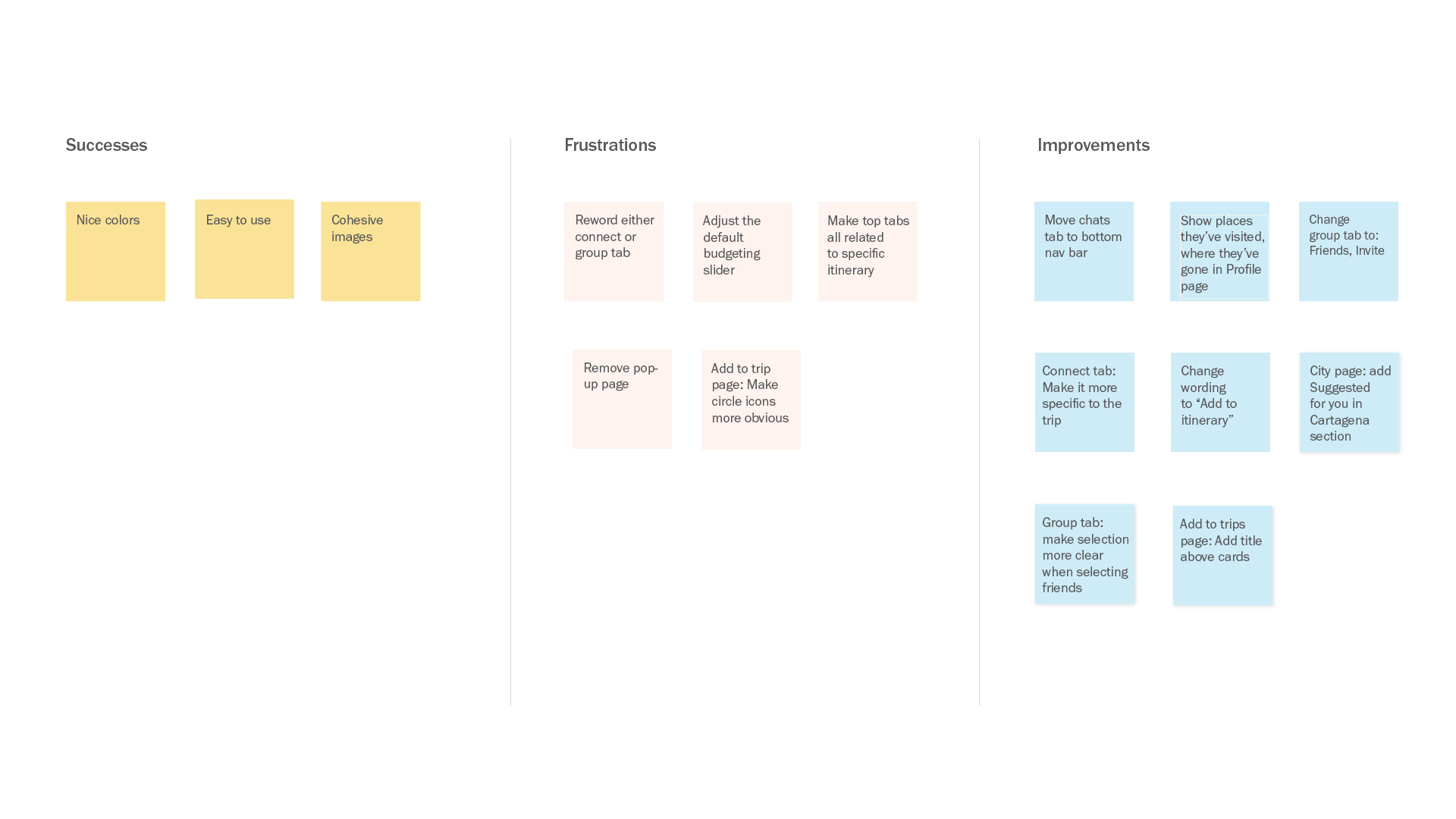
Using my prototype, I conducted usability testing with four participants. This helped me gain insights on friction points for the three task flows:
1. Search for a destination and create an itinerary.
2. Invite friends on the trip and create a group chat.
3. Connect with a fellow traveler.
An affinity map was created to make priority revisions that were reflected in high-fidelity wireframes.
Iterations
Findings
- The Chats tab was moved from the top to the bottom navbar since the top bar is exclusive to the trip, but the chats tab isn’t and users can access conversations about other topics from that tab.
- Users mixed up the meaning between the group and connect tabs, so the group tab changed to Friends. That helps users know to invite them on the trip.
Insights
The prototype was quite a success. Overall, users found it appealing and easy to use. It addressed users' pain points for travel planning and offered more than they expected. The ability to curate trips, chat, connect with the community and friends, and share travel experiences was especially appreciated.
